
SADIE’S KITCHEN
ABOUT
Sadie’s Kitchen is a dog food brand inspired by the homemade food my mom makes for our dog, Sadie. They care about the health of our furry friends and feeding them the best food possible. They accomplish this mission through fresh ingredients and no processing.
OBJECTIVE
Create a brand identity for a fresh dog food that reflects the personality of the brand ambassador (Sadie). Emphasize approachability, playfulness, and a loving heart.
BRANDING | PACKAGING
BEHIND THE NAME
Sadie is the name of my dog and the face of the brand. The food is made in the kitchen and is where Sadie stands waiting around to taste test.
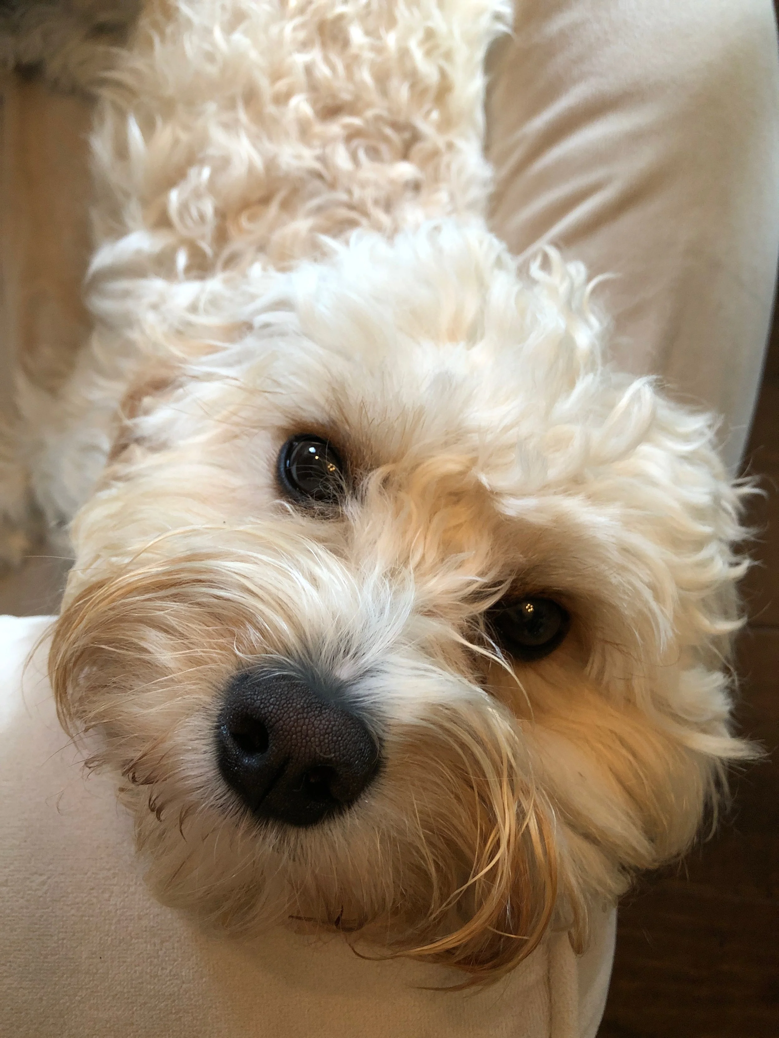

FACE OF THE BRAND
Since Sadie’s Kitchen is inspired by Sadie herself, I wanted to make her the face of the brand. I created an illustration of her with a cartoon-like style to reflect her playful nature. By using soft colors and rounded lines it also reflects her sweet, loving nature.
The featured characteristics of Sadie’s personality – playful and loving – are further enhanced in other design elements. First being the bright pink color. I also chose that color as it’s a color that complements her well in real life. The second one being the typeface. The typeface being in a handwritten style also ties into the homemade aspect of the food and being approachable.